Modernizing Jobber Payments
2023
Jobber is an operations management software for home service businesses. Used by 200K+ businesses in more than 60 countries.
I led a mobile payments redesign that evolved the existing design system, resulted in positive user feedback and a company-wide culture shift towards consumer-grade experiences.
My role: UX/UI design, interaction design, usability testing, cross-functional and cross-team collaboration.
Goals
Modernize code and UX
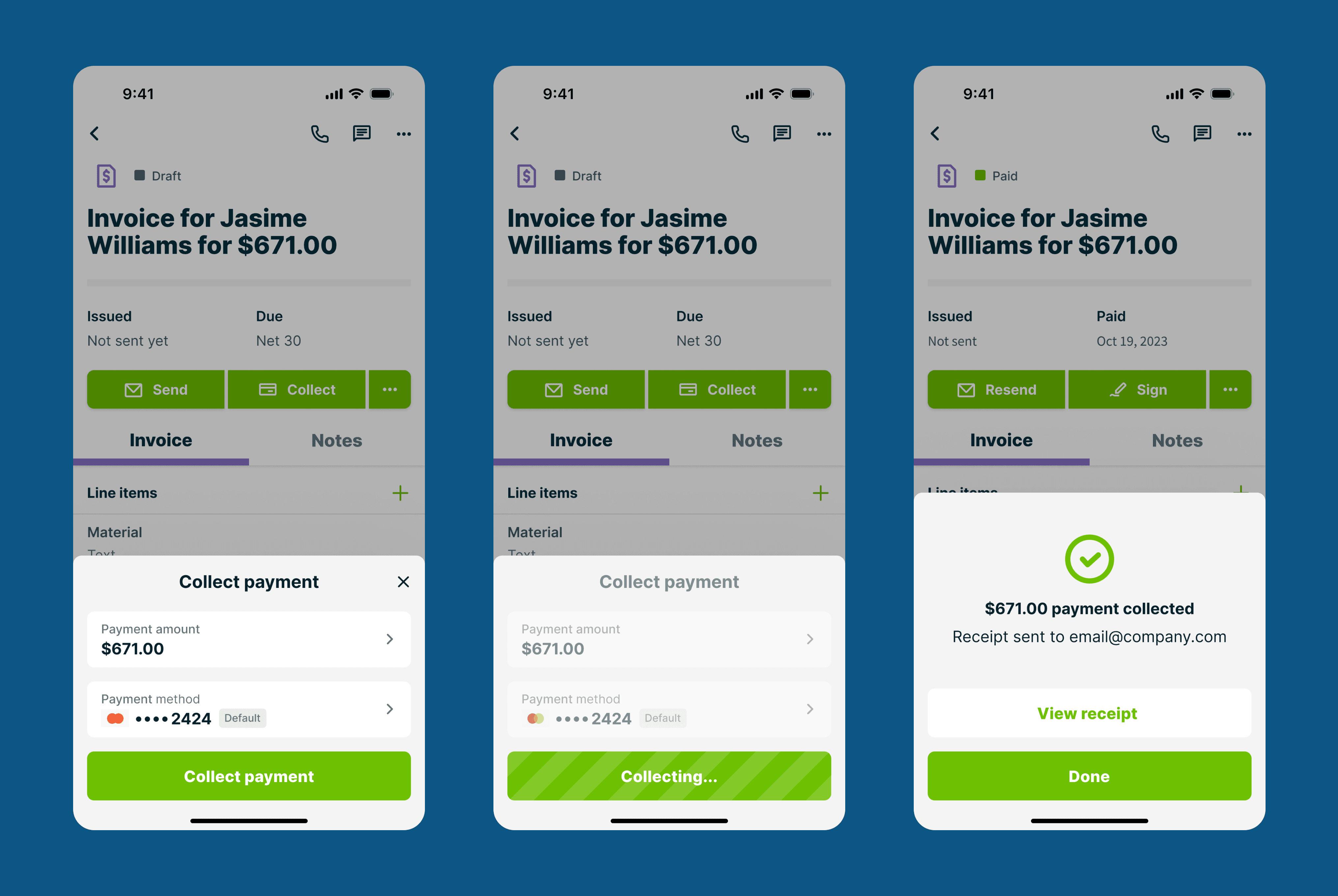
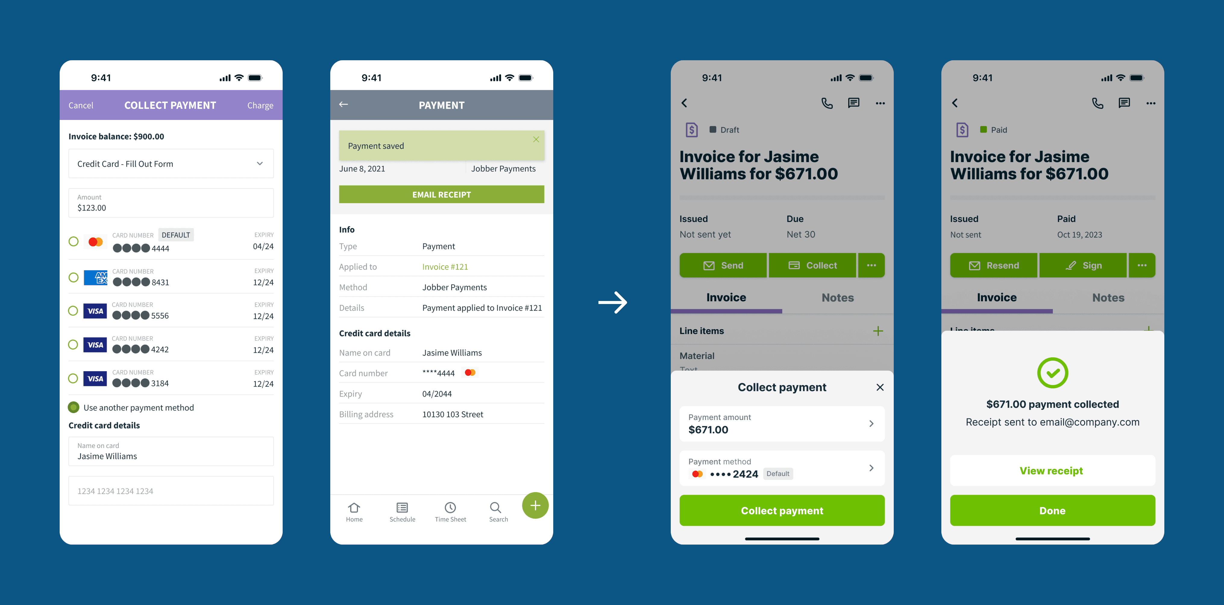
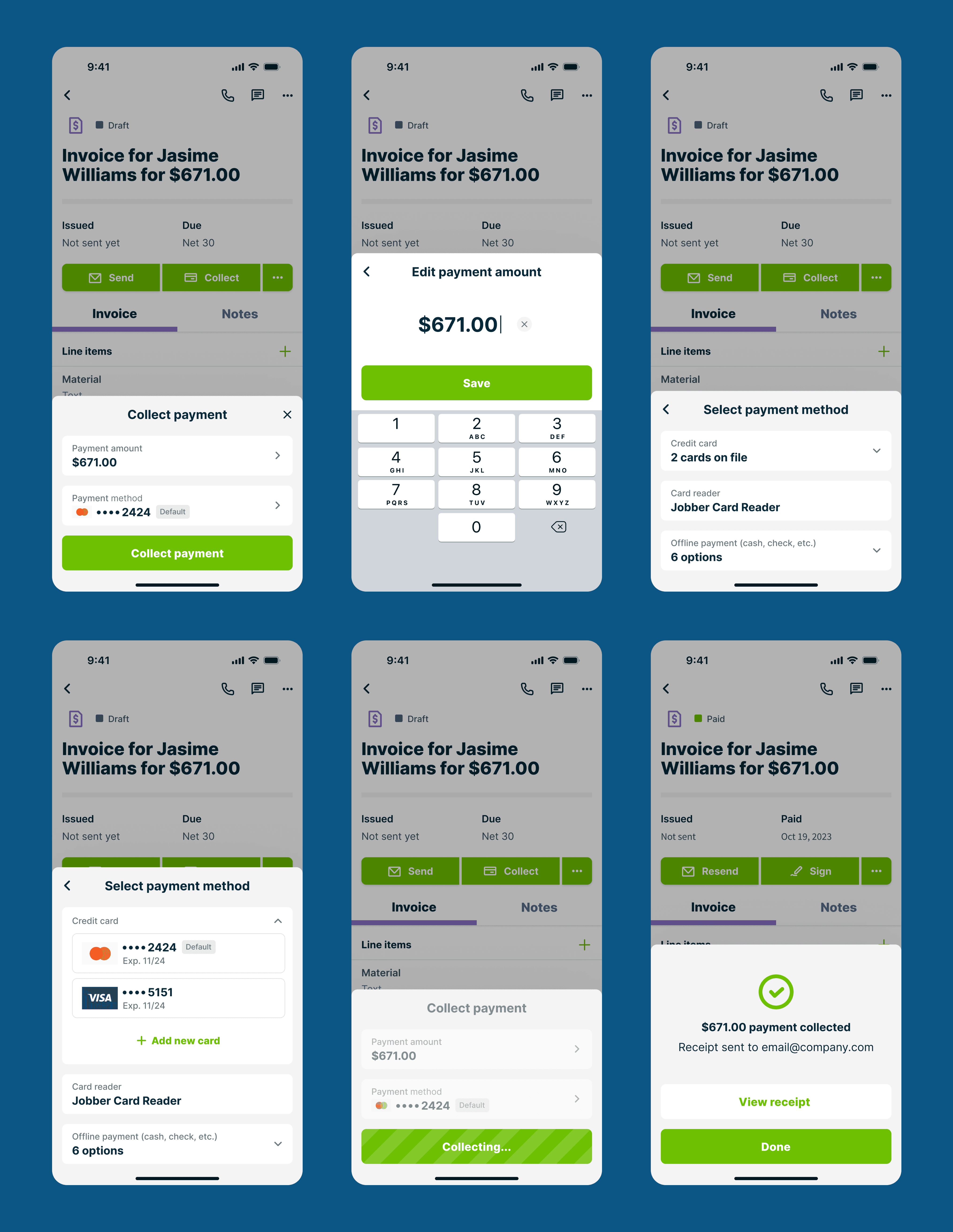
Following the company-wide push for consumer-grade experiences, we aimed to update the outdated payment flow's codebase and design from previous app versions, as well as introduce new consumer-grade design patterns.
Enhance user experience
Although the payment flow had no major issues, user feedback highlighted the need for some small but highly requested quality-of-life improvements. For example, showing wether payment receipt was sent automatically, or better distinguishing between charging a credit card and registering a credit card payment made outside Jobber app.
Overcome reluctance
Additionally, together with product manager, we needed to develop a strategy to overcome the team’s reluctance to deviate from existing design components. It required evolving our mindsets from shipping things as fast as possible to investing the time to develop higher quality consumer-grade experiences, including learning new skills and bending a few design system rules.
Approach
Discovery research
We combined findings from past user research and insights from conversations with sales and customer support teams with a deep dive into new customer feedback in our database. Then prioritized, aligned with stakeholders and had our initial to-do list. As always, this to-do list went through a few iterations during the design phase.
Team communication
To keep the team focused on the goal of a consumer-grade experience, product manager and I reiterated the company strategy and redesign goals throughout the project when reviewing designs. It helped that around the same time consumer-grade was a big topic in company wide meetings.
Collaboration
I led design exploration and ideation cycles with the team and stakeholders to align, reiterate redesign goals and make sure proposed changes pushed the existing design patterns to evolve, but were still within the brand aesthetic and possible to build in a sensible amount of time.
Covering skill gaps
To translate my initial animation prototypes into a polished working code, I collaborated with an experienced design engineer outside of the team to create the animated components for the design system.
Usability testing
I conducted internal usability testing with colleagues from other departments to check for major UI and copy issues and adjusted designs accordingly.
Outcomes
Design system evolution
This project led to a design system evolution, including the reuse and development of the bottom sheet pattern in new features like Jobber Money. It also forced discussions in the design team and concrete plans on redesigning the mobile app further.
Culture shift
The redesign fostered a culture shift, encouraging engineers to experiment with new components and inspiring other teams to invest in consumer-grade user experience.
Positive user feedback
While the quality-of-life improvements had no immediate impact on key metrics, we received positive user feedback, with comments like, “Wow, you should be louder about cool improvements like this.”


